Tuesday, December 9, 2008

Photo Tips

1. Alter Your Perspective
Most portraits are taken with the camera at (or around) the eye level of the subject. While this is good common sense - completely changing the angle that you shoot from can give your portrait a real WOW factor.Get up high and shoot down on your subject or get as close to the ground as you can and shoot up. Either way you’ll be seeing your subject from an angle that is bound to create interest.


10. Take a Series of Shots
Switch your camera into ‘burst’ or ‘continuous shooting’ mode and fire off more than one shot at a time.In doing this you create a series of images that could be presented together instead of just one static image.This technique can work very well when you’re photographing children - or really any active subject that is changing their position or pose in quick succession.

Friday, December 5, 2008

Monday, November 24, 2008

Famous Portraits

This a self portrait of Gabriella Hennessey. I like this picture because of the way it is lit. How it is dark yet with photoshop she made the lightbulb light up, and how she is wearing a white shirt yet everything else is a dark color.


This is a portrait of Alfred Krupp, by Arnold Newman. Its creepy and fun, and i love how it uses leading lines.
I think that personally lines make a good picture. I like the artsy types of photos and lines and interesting lighting make me smile. I love when light makes a certain shadow or a line continues to lead your imagination to continue to move. In my next photo shoot i would like to do portraits yet be able to go to different places or use lighting tools.. or do it digital so we can do fun photoshop.

Friday, November 14, 2008

Photo Ethics(Dove Commercial)

1)In this video they changed how long and skinny her neck is, they also changed her eye placement. They did this to make her seem more beautiful, when really she was beautiful to begin with but they made a false sense of beauty. This why people consider them selves ugly because they don't look like that, when in reality she doesn't even look like that.

2)I don't think this is okay to do. I think we should be accepting and find beauty in the average woman. When they change these women to look more "beautiful" we feel we have to match that when really its impossible. Which gives us a sense of failure, instead of acceptance.

3)I don't think it was extremely wrong to do, i think that there have been many worse examples of ethical photoshop. But i don't believe it was right to do. I think the woman was completely beautiful before she had the make up and photoshop, so i don't see why it was necesary.

4)I don't think it was okay because it gives women a false sense of beauty. Which is basically lying.. well to me it is.

5)I think photojournalism is more natural realistic photos, i mean you are trying to show the event so you want to take pictures of how it happened. When fashion photography or commercial photography can be photoshopped, no one knows what the original picture looks like so why not change it to look better or prettier.

6)I think photojournalism is directly connected with reality and showing the event or thing that happened at that time. but fashion photography can be anything you want it to be. Which is why i think it is unethical.

Friday, November 7, 2008

University of Wisconsin's mistake!!

Recently the University of Wisconsin revamped its application pamphlet, Originally they had chosen a picture from 1993 of cheering fans, incoincedently it was an all white crowd and they wanted to express their diversity at the school. With out any review, Admissions Director Robert Seltzer, had photo shopped an African American man's face(from a picture from 1994) into the crowd. Obviously this was a big noticeable mistake. The were extremely scrutinized for this dumb decision.

I think it was wrong. They could have chosen a more recent picture that showed the diversity, or they could have created a collage. Those choices would have been much more acceptable.
i think this is completely unethical because this never happened. And it is noticable that this wasn't at the same time. Which makes it look fake. And makes me want to believe that their story is fake too. I wouldn't believe the information that they give.
before:1970 after:1995
i think this is ethical, because they wanted to re-publish this photo, so they made it a tiny bit brighter so that you could see the image better. I think its ethical because it didn't change what was happening in the story or make anything up, it just made it more visible. I think this was a good editing choice

Wednesday, November 5, 2008

extra credit/obama president-elect

1. The historic event that happened, was that a first black president was elected, but what was even more astounding in my views is that they did polls and almost all people said that race wasn't an issue. Which means people weren't just electing him because he's black but because he is right for this country.

2. It affects my life in every way. I am a citizen of the United States, He will be my new president. He will be making changes to the economy and to the war, this effects me directly and indirectly. But my well being and education and economic status rests in his hands. i am very affected by this.

3. I think it will better us. In others view of us as a nation, and will directly improve the war and our economic struggle. i believe he will do what is right for the people and will listen.

Monday, November 3, 2008

Print Evaluation

i don't have a caption because i don't know what to write about chairs.. i can't create a story for them.. trust me i tried.


1. There are only certain things that are in complete focus.
a. The seats are in main focus and then the people and background is out of focus.
b. Its like this because i didn't want the people to be the focus.. i wanted the lines of the chairs to be the focus.


2.I think there is somewhat good contrast.. but it is very grey.
a. i think part of the problem may have been my camera settings but i also think that it may have been the odd lighting in the theatre.. that lighting seems to make skin look different so i think it may have affected how my picture's color looks.

3. I think i followed the rules. I think that i used the rules to my advantage in making an appealing picture.
a. I used lines, and repetition the most. i used the lines of the chairs to creat leading lines. and the amount of chairs to create repetition.

4. No there aren't any spots on my picture.

5. No, there are no rings or spots at all.

6. Yes everything is stored in the proper place.

Thursday, October 30, 2008

Funny Pictures

This is a bad dog.. found his way into the pot of spaghetti(although probably staged). His owners thought it would be funny to cover the poor dog in noodles.


At home, on a cold winter day, jennifer, my precious neice decided she did not appritiate the dog kissing her hand. She is screaming and yelling and extremely angry at our puppy. We were taking care of her for the weekend.. not knowing that would be her reaction to our beloved dog.


Assembly line workers prepare our rare square watermelons. As watermelon by watermelon go by they are being carefully inspected and sent on their way. The only difference is that these are square and are much easier to handle. These were created when a box was grown around them and as they grew they fit to their surroundings.
(sorry not very creative..)


Repetition

An estimated 250,000 blue plastic ducks float down the River Thames during the Great British Duck Race, which raises money for charities.

*This is obviously repetition because the blue ducks just keep going.. there is no end.. there are more and more and more. It makes the picture seem like there are billions of ducks or trillions even. And i think its funny!

A laborer plants flowers for the Beijing Olympic Games in Beijing, China. It is estimated that more than 40 million plants will be placed around the city during the games.

*its repetition because the trees keep repeating till the eyes go to the man/subject in the middle. i also like it cause you can see pink flowers in the background.


Lisa Simpson appears on television screens on a new Singapore Airlines Airbus A380 after its inaugural passenger flight from Singapore to Sydney, Australia.

*its repetition because not only do the seats repeat but so does the image on the screens of every seat, and it just keeps going for what seems like forever!

Friday, October 24, 2008

Sugar Hill

1. Melanie Burford in addition to the photography used music and dialog to complement the pictures to give them more of a story.

2. They helped tell the story. They gave a saddness and lack of hope that most of them are feeling. it made her pictures more breath taking cause they gave a sense of background or knowledge, and more emotion.

3. I think the most effective thing is the music behind the video.

Post Shoot Reflection

1. Some problems i encountered were that people were not comfortable with me getting close to them to take the picture. I had to search for people who were comfortable with me getting close and typically these were people who knew me and were friends with me.

2. The thing i was thinking about the most while shooting was lines. I wanted to get good lines. Because when i evaluate other peoples photos i look for lines, and the ones that have lines happen to be my favorite pictures. So when i am taking pictures i want to take something that i would want to look at. If that makes sense! lol

3. like i said i used lines...but i also tried using rule of thirds to make the photo appealing. i wasn't as succesful as i had hoped! : )

Tuesday, October 14, 2008

B&W Photographer-Senses

My photographer is Dorothea Lange.

1. While looking at her photos i noticed that she uses lines to an extent(which is my forte), but mainly she liked using things that were either up front in your face with simplicity or using the rule of thirds and balance to place something upfront but also put a subject in the background.

2. the first photo:(putting my self in the photographer's place)
i see:two men walking down a long dirt path, tired, exaughsted, poor. and all they see is a luxury billboard, and how they are imagining how they wish their lives were.
i smell:dirt, dry air, heat and sweat. there is miles and miles of dirt and thats all you seem to smell, no flowers or greenery, just dirt and dry.
i hear: the rustling of feet on a dirt gravel road. the sounds of a train and a tractor in the far far distance. just the sounds of these 2 men walking.
i taste: nothing, the dry dirt, no water or food for miles, just the shear essence of my surroundings of dirt and nothing else.
i feel: sad. i feel like they are alone in the world and no one cares. i feel like no one has cared for these men so they are off to find somewhere new, and new start.

the second photo:(putting myself in the photographer's place)
i see: children all in rows, hands on heart, and reciting the pledge to our flag. i see a japanese american girl with a perplexed face, like either not remembering or not seeing the importance of the pledge. she looks uneasy about her surroundings.
i smell: the sweetness of a classroom, maybe a perfume smell of the teacher. i smell innocence and kindness.
i hear:childrens voices in unison reciting the pledge of alligence. almost to a point where it is loud yelling, like they want to make sure that their voice gets heard above everyone elses, i hear incorrect verses, and a bunch of jumbled mess of sound.
i taste: nothing imparticular, nothing really at all.
i feel: sad for this child. being forced against her beliefs to recite this, i feel sad that this is what it has come to that children are forced to say the pledge, forced against their right.

third photo:(putting myself in the photographer's place)
i see: a sad young girl, tired, and poor, i see her mother in the background, also tired and sad. seeming like they are doing whatever they can to get by but its not enough. i see them surrounded by dirt, they own little, and are left sad from the outcome of the economy and their lives.
i smell: dirt, dry air, just dirt. no smells of flowers or greenery or cooking or perfume, just dirt. it is a dry smell, and unappritiated smell. a poor smell.
i hear: the sound of wind along the flat plains. the rustling of their dresses in the wind, nothing else, silence. dead silence.
i taste:dry dirt, nothing of any importance. there is no water or food just dirt, and sadness. only dirt.
i feel: like there is something i can do to help these people. something i can do to make their lives a bit easier. but there is nothing. nothing i can do. i feel the need to reach out to them even though i cant. i feel sadness.


3. If given the opportunity to publicize my photographer to the class and school i would like to make a poster. i think i could make a good demonstration of her photos through a poster.

Tuesday, October 7, 2008

Developing Film in The Darkroom

1.Turn off all lights in the darkroom(must be pitch black, no light leaks)

2.pry off top of film canaster(flat side) and take out the film

3.tear the little plastic roll off of the end of the roll of film

4. put your roll of film on the reel and place in the tank(light sealed canaster)

5. make sure the lid is on tight

6. then you may turn the lights back on.
7. take your tank with the film in it to the trough with the chemicals

8. first you pour in a developer(has to be at exactly 68 degrees). You leave it in the tank for about a minute to a minute and a half, you must adjatate it for the first 10 seconds and after every minute for 10 seconds after.

9. tap the tank and then pour out the developer into the drain

10. then you pour in the stop bath, which stops the development for 30 seconds

11. then pour that back into the container to save it.

12. then we pour in the fixer for about 5-10 minutes.

13. now you can remove the lid because the film is fully developed. you may now look at your film if you wish to.

14. put your reel into a cold water wash for about 5 minutes.

15. then pour in a Perma wash which washes the film off and removes any traces of fixer and agitate that for 2 minutes

16. then put in another water wash for 5 minutes

17. then hang to dry in a dust free room or area for about 1-2 hours

18. then it is dry and you have completed negatives, and you can cut your negatives into 5's and put them in negative sleeves.

AND THEN YOUR DONE!!!!!! YAY!!!

Great B&W Photographers Revisited

Dorothea Lange:Biography
Born: May 26, 1895
Birth place: Hoboken, New Jersey
Died: October 11, 1965

When Dorothea was 7 she was diagnosed with polio which left her an obvious limp which her own mother was ashamed of. Dorothea's dad walked out on her family when she was young, and dorothea's family moved in with their grandmother and aunt, which is when she discovered that she enjoyed photography and wanted a job doing that instead of her mothers ambitions of her being in education. Dorothea lived a full life with many friends and family, she created a name for herself as a famous photographer mainly in the 1930's during the great depression where her work is more noticed.


Friday, October 3, 2008

What the Pros are doing-Sports


focal length of lens-there isn't a far focal length, it is relatively close to the action, but to the background there is a very far focal length.
shutter speed-5.6
what is the effect of this shutter speed?-to let in the correct amount of light and to catch the action.
aperture-1/250
what is the effect of this aperture setting?- it is meant to capture fast moving items.. and because they are playing sports it makes complete sense.
position-he had the camera positioned on the ground up to get the structural view of the building but also to catch the action of the people.

Tuesday, September 30, 2008

Inspiring Photo Contest Entry


I did not find this picture as inspiring as i did just powerful. Its is powerful because it uses lines(the chains) to cross over her face and because they are out of focus you see her face through the chains. Which creates your attention to go straight to her eyes and try and see what she's thinking but its almost impossible. Which brings me to another point of how its mystery makes it even more powerful. You don't know who she is, where she is, what she's doing, or her background story, all you see is her and not much else.

Monday, September 29, 2008

Filling The Frame


I saw this as filling the frame. Not only because there is no space left empty, but the effect of it all fills the frame as well. Having everyone circle the main subjects creates a view point and having the entire frame filled with the surrounding people makes it seem 100 times more interesting and important. And really grabs your attention!

Action and Emotion


This picture just screams action and emotion. The picture captures her movement and creates a vision of her continuing to dance even though the picture is still. You can tell she is dancing which is the action, but the shear joy on her face and how you can tell she is truly having fun creates amazing emotion to the picture.

The Story


I think the story for this photo is a father telling his daughter all about where they are standing, and how it was created, you know the " a long time ago all of this was covered in water" speech. Describing how the weather changed that cliff and made it look the way it does now... and how its been here for millions and millions of years. This picture gave me a father telling a story or teaching a lesson feel to it.

Thursday, September 25, 2008

Financial Crisis

For extra credit we were supposed to read about the financial crisis happening in the US.

*Bush is pushing to use $700 billion for big corporations that are sinking, and to save them.

*Congress is beginning to agree.

*This will be paid with tax dollars from American citizens.

I think that as a country we should use the money to help improve the education system, or finding new ways to improve our environment by researching new fuel ideas. Or help health care, or pay off debts of American citizens. But why on earth should we help companies, that make our economy bad in the first place and who have depleted them selves, to rise again and help them control our lives. We should let them suffer, they should try and fix them selves. There are so many more ways to use that money then help big power companies become even bigger! Whats the point? Other than ruining us middle class citizens.

Here are some cartoons that i found that i appreciated and were related:


Tuesday, September 23, 2008

My Pinhole Pictures!!!

My pinhole pictures!!!
(the top picture is my positive image, and the bottom image is my negative version)

1.) Well first off the images are backwards. What is on the left of the negative image is on the right of the positive image. Also everything that is white in the negative image is black in the positive image.
2.) Dictionary.com definition of negative: noting an image in which the brightness values of the subject are reproduced so that the lightest areas are shown as the darkest.
my negative looks different from my positive, because the negative version flips the darks and lights so what in real life is dark turns out white and what is light in real life turns out dark.
3.) The edges are slightly bent in my photography because it is such a wide angle that when it travels through the lens it warps the image.

Friday, September 19, 2008

Famous Black & White Photographers(favs.)

LEWIS HINE


DOROTHEA LANGE


JOSEF KOUDELKA

Wednesday, September 17, 2008

Hurricane Ike

This photo stuck out to me, because of its use of the S-curved line. The traffic looks like it goes on forever and never ends, because the curve of the line makes it continue out of view and makes you think that it continues on and on and on beyond the picture. You can also get a sense of how the drivers of all those vehicles feel. You can tell how long and agonizing it would be to have to wait in that line.


I liked this picture, because it uses avoiding the merger so your focus goes straight to the crashed boat on the island. There isn't alot of detail in the background or the picture, but you can still see the subject clearly and relize what had happened.

Thursday, September 11, 2008

9-11/photo techniques

This is Simplicity.
Its simplicity because you see the subject with minimal background. This picture is very simple and that assures your focus on the subject.


This is The Rule of Thirds.
You see the two subjects in two different positions(upper left, and lower right). This draws your attention to both subjects. Keeping the subjects separate creates a feel to it, but the fact that they are in the same room keep them connected.

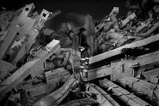
This is using Lines.
None of the lines are S-curved or intentionally in a position, but they do lead to the subject, which was great placement of the firefighter even if it wasn't intentional. It is a leading line. All of the ruble leads your attention to the firefighter in center of the picture.


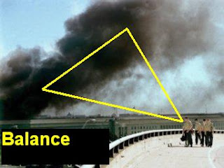
This is Balance.
I consider this balance, because of a somewhat triangle shape that's created. With the smoke being 2 points and and the people being the other point.
Like this.


This is Framing.
Obviously the remains are framing the other remains. This is a great example of framing. Because it completely surrounds the photo.


This is Avoiding The Merger.
There is limited background so you focus just goes straight to the subject. And there is nothing to distract you or confuse you.

Wednesday, September 3, 2008

Pinhole Pictures

I LIKED THIS ONE

1. There are no people in this, but there are objects that capture your attention, there is no blur.

2. The further away seems to be more in focus but everything is really sharp very little soft focus.

3.The image is very warped. Being a construction site the building would be straight and not curved but in this picture it looks very very curved, which gives it a more artistic feel.


I DON'T LIKE THIS ONE.
1. Yes there are people in this picture, and it is extremely blurred. It is so blurred that you can't make out any features.

2.The focus is soft because it is so blurred that nothing is in focus.

3. The image isn't warped.

Single-lens_reflex_camera


4 words i think are important about cameras are:


lens- pieces of glass either curved or only one curved used to change the lines which light passes


zoom- used to bring a subject either closer or further away then reality.


diaphragm mechanism- controls the amount of light that passes through.


view finder-helps photographer find its subject by looking through it.


Mr.Reeve's words:


aperture-limits the amount of light that passes through.


shutter-opens and closes the aperture to expose film


exposure- the act of showing light to a photo sensitive surface


depth of field-distance between furthest and closest objects in a picture


F-stop-the setting of adjustable lens aperture


focal length-distance from focal point


Friday, August 29, 2008

Mr.Reeves Pics

I don't like this picture, the focus is off and the subject of the picture is blurred and not centered.


I like this one not because of the subjects or that its clear or anything, but i like how everything seems symetrical. and how everyone is looking at the camera with different facial expressions.


Obama's Speech at The DNC

Last night Obama made a speech about McCain's Choice for running mate. His speech used very smart literary terms. He was able to congradulate Palin for the new position, yet also mentioned that she wasn't right for the job. Highlighting the fact that she had "zero" foriegn policy experience. This was very logical because he was congradulatory, yet still proved that it wasn't the best choice for McCain's campaign, which incoincidently helps Obama.

Best and Worst!!!

I like this photo because you can see the perspective of the person speaking. and you can tell what she's doing, also the angle, from above and behind, gives it a different feel where the main focus of the picture you can't even see her features.
I don't like this picture because its not well lit. Although it is an interesting pose, it doesn't have as much effect as it could. Also you cant tell where shes at or what shes doing... for a picture like this i would like you to be able to see the story in the picture.


Wednesday, August 27, 2008

Welcome to My Blog!

The font is colorful because... its more interesting!!!!!