I did not find this picture as inspiring as i did just powerful. Its is powerful because it uses lines(the chains) to cross over her face and because they are out of focus you see her face through the chains. Which creates your attention to go straight to her eyes and try and see what she's thinking but its almost impossible. Which brings me to another point of how its mystery makes it even more powerful. You don't know who she is, where she is, what she's doing, or her background story, all you see is her and not much else.
Tuesday, September 30, 2008
Monday, September 29, 2008
Filling The Frame
I saw this as filling the frame. Not only because there is no space left empty, but the effect of it all fills the frame as well. Having everyone circle the main subjects creates a view point and having the entire frame filled with the surrounding people makes it seem 100 times more interesting and important. And really grabs your attention!
Action and Emotion
This picture just screams action and emotion. The picture captures her movement and creates a vision of her continuing to dance even though the picture is still. You can tell she is dancing which is the action, but the shear joy on her face and how you can tell she is truly having fun creates amazing emotion to the picture.
The Story
I think the story for this photo is a father telling his daughter all about where they are standing, and how it was created, you know the " a long time ago all of this was covered in water" speech. Describing how the weather changed that cliff and made it look the way it does now... and how its been here for millions and millions of years. This picture gave me a father telling a story or teaching a lesson feel to it.
Thursday, September 25, 2008
Financial Crisis
For extra credit we were supposed to read about the financial crisis happening in the US.
*Bush is pushing to use $700 billion for big corporations that are sinking, and to save them.
*Congress is beginning to agree.
*This will be paid with tax dollars from American citizens.
I think that as a country we should use the money to help improve the education system, or finding new ways to improve our environment by researching new fuel ideas. Or help health care, or pay off debts of American citizens. But why on earth should we help companies, that make our economy bad in the first place and who have depleted them selves, to rise again and help them control our lives. We should let them suffer, they should try and fix them selves. There are so many more ways to use that money then help big power companies become even bigger! Whats the point? Other than ruining us middle class citizens.
Here are some cartoons that i found that i appreciated and were related:
Tuesday, September 23, 2008
My Pinhole Pictures!!!
My pinhole pictures!!!
1.) Well first off the images are backwards. What is on the left of the negative image is on the right of the positive image. Also everything that is white in the negative image is black in the positive image.
(the top picture is my positive image, and the bottom image is my negative version)
1.) Well first off the images are backwards. What is on the left of the negative image is on the right of the positive image. Also everything that is white in the negative image is black in the positive image.
2.) Dictionary.com definition of negative: noting an image in which the brightness values of the subject are reproduced so that the lightest areas are shown as the darkest.
my negative looks different from my positive, because the negative version flips the darks and lights so what in real life is dark turns out white and what is light in real life turns out dark.
3.) The edges are slightly bent in my photography because it is such a wide angle that when it travels through the lens it warps the image.
Friday, September 19, 2008
Wednesday, September 17, 2008
Hurricane Ike
This photo stuck out to me, because of its use of the S-curved line. The traffic looks like it goes on forever and never ends, because the curve of the line makes it continue out of view and makes you think that it continues on and on and on beyond the picture. You can also get a sense of how the drivers of all those vehicles feel. You can tell how long and agonizing it would be to have to wait in that line.
I liked this picture, because it uses avoiding the merger so your focus goes straight to the crashed boat on the island. There isn't alot of detail in the background or the picture, but you can still see the subject clearly and relize what had happened.
Thursday, September 11, 2008
9-11/photo techniques
This is Simplicity.
Its simplicity because you see the subject with minimal background. This picture is very simple and that assures your focus on the subject.
This is The Rule of Thirds.
You see the two subjects in two different positions(upper left, and lower right). This draws your attention to both subjects. Keeping the subjects separate creates a feel to it, but the fact that they are in the same room keep them connected.
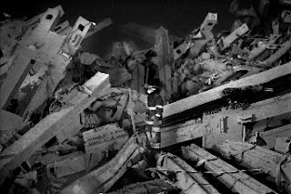
This is using Lines.
None of the lines are S-curved or intentionally in a position, but they do lead to the subject, which was great placement of the firefighter even if it wasn't intentional. It is a leading line. All of the ruble leads your attention to the firefighter in center of the picture.
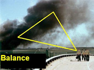
I consider this balance, because of a somewhat triangle shape that's created. With the smoke being 2 points and and the people being the other point.
Obviously the remains are framing the other remains. This is a great example of framing. Because it completely surrounds the photo.
There is limited background so you focus just goes straight to the subject. And there is nothing to distract you or confuse you.
Wednesday, September 3, 2008
Pinhole Pictures
I LIKED THIS ONE
1. There are no people in this, but there are objects that capture your attention, there is no blur.
2. The further away seems to be more in focus but everything is really sharp very little soft focus.
3.The image is very warped. Being a construction site the building would be straight and not curved but in this picture it looks very very curved, which gives it a more artistic feel.
I DON'T LIKE THIS ONE.
1. Yes there are people in this picture, and it is extremely blurred. It is so blurred that you can't make out any features.
2.The focus is soft because it is so blurred that nothing is in focus.
3. The image isn't warped.
Single-lens_reflex_camera
4 words i think are important about cameras are:
lens- pieces of glass either curved or only one curved used to change the lines which light passes
zoom- used to bring a subject either closer or further away then reality.
diaphragm mechanism- controls the amount of light that passes through.
view finder-helps photographer find its subject by looking through it.
Mr.Reeve's words:
aperture-limits the amount of light that passes through.
shutter-opens and closes the aperture to expose film
exposure- the act of showing light to a photo sensitive surface
depth of field-distance between furthest and closest objects in a picture
F-stop-the setting of adjustable lens aperture
focal length-distance from focal point
Subscribe to:
Posts (Atom)